![]() |
![]() |
|||||||||||||||||||||
![]() |
![]() |
![]() |
||||||||||||||||||||
![]() |
||||||||||||||||||||||
![]() |
||||||||||||||||||||||
![]() |
||||||||||||||||||||||
![]() |
||||||||||||||||||||||
Tourism Elliston |
![]() |
![]() |
||||||||||||||||||||
![]() |
![]() |
|||||||||||||||||||||
Tourism Elliston 
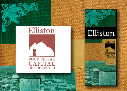
Challenge: The town of Elliston required a visual identity and brochure to promote the town's tourism. The logo concentrates on the root cellar, a mysterious monument, over a hundred years old. Root cellars allow an adventurous visitor to peer into the lives of early outport Newfoundland. The brochure takes the heritage and historic aspects of the town one step further, with its rough, natural textures and traditonal feel.
|
![]() |
|||||||||||||||||||||
![]() |
||||||||||||||||||||||
|
![]() |
|||||||||||||||||||||
![]() |
||||||||||||||||||||||
|
|
![]() |
||||||||||||||||||||
![]() |
![]() |
|||||||||||||||||||||
![]() |
||||||||||||||||||||||
![]() |
||||||||||||||||||||||
![]() |
![]() |
![]() |
![]() |
![]() |
![]() |
![]() |
![]() |
![]() |
![]() |
![]() |
![]() |
![]() |
![]() |
![]() |
![]() |
![]() |
![]() |
![]() |
![]() |
![]() |
![]() |